Showing posts tagged Mission Control
Just a quick announcement that the first “production-ready” version of Mission Control just went live yesterday, at this easy-to-remember URL:
https://missioncontrol.telemetry.mozilla.org
For those not yet familiar with the project, Mission Control aims to track release stability and quality across Firefox releases. It is similar in spirit to arewestableyet and other crash dashboards, with the following new and exciting properties:
- Uses the full set of crash counts gathered via telemetry, rather than the arbitrary sample that users decide to submit to crash-stats
- Results are available within minutes of ingestion by telemetry (although be warned initial results for a release always look bad)
- The denominator in our crash rate is usage hours, rather than the probably-incorrect calculation of active-daily-installs used by arewestableyet (not a knock on the people who wrote that tool, there was nothing better available at the time)
- We have a detailed breakdown of the results by platform (rather than letting Windows results dominate the overall rates due to its high volume of usage)
In general, my hope is that this tool will provide a more scientific and accurate idea of release stability and quality over time. There’s lots more to do, but I think this is a promising start. Much gratitude to kairo, calixte, chutten and others who helped build my understanding of this area.
The dashboard itself an easier thing to show than talk about, so I recorded a quick demonstration of some of the dashboard’s capabilities and published it on air mozilla:
link
Yep, still working on this project. We’ve shifted gears somewhat from trying to identify problems in a time series of error aggregates to tracking somewhat longer term trends release over release, to fill the needs of the release management team at Mozilla. It’s been a good change, I think. A bit of a tighter focus.
The main motivator for this work is that the ADI (active daily install) numbers that crash stats used to provide as input to a similar service, AreWeStableYet (link requires Mozilla credentials), are going away and we need some kind of replacement. I’ve been learning about this older system worked (this blog post from KaiRo was helpful) and trying to develop a replacement which reproduces some of its useful characteristics while also taking advantage of some of the new features that are provided by the error_aggregates dataset and the mission control user interface.
Some preliminary screenshots of what I’ve been able to come up with:
![]()
![]()
One of the key things to keep in mind with this dashboard is that by default it shows an adjusted set of rates (defined as total number of events divided by total usage khours), which means we compare the latest release to the previous one within the same time interval.
So if, say, the latest release is “59” and it’s been out for two weeks, we will compare it against the previous release (“58”) in its first two weeks. As I’ve said here before, things are always crashier when they first go out, and comparing a new release to one that has been out in the field for some time is not a fair comparison at all.
This adjusted view of things is still not apples-to-apples: the causality of crashes and errors is so complex that there will always be differences between releases which are beyond our control or even understanding. Many crash reports, for example, have nothing to do with our product but with third party software and web sites beyond our control. That said, I feel like this adjusted rate is still good enough to tell us (broadly speaking) (1) whether our latest release / beta / nightly is ok (i.e. there is no major showstopper issue) and (2) whether our overall error rate is going up or down over several versions (if there is a continual increase in our crash rate, it might point to a problem in our release/qa process).
Interestingly, the first things that we’ve found with this system are not real problems with the product but data collection issues:
Data issues aside, the indications are that there’s been a steady increase in the quality of Firefox over the last few releases based on the main user facing error metric we’ve cared about in the past (main crashes), so that’s good. :)
If you want to play with the system yourself, the development instance is still up. We will probably look at making this thing “official” next quarter.
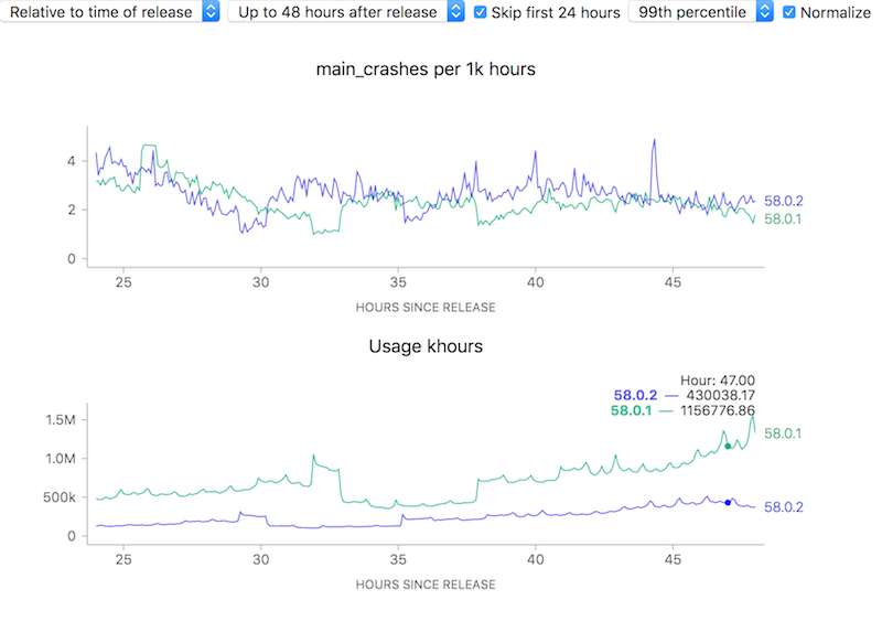
To attempt to make complex phenomena more understandable, we often use derived measures when representing Telemetry data at Mozilla. For error rates for example, we often measure things in terms of “X per khours of use” (where X might be “main crashes”, “appearance of the slow script dialogue”). I.e. instead of showing a raw count of errors we show a rate. Normally this is a good thing: it allows the user to easily compare two things which might have different raw numbers for whatever reason but where you’d normally expect the ratio to be similar. For example, we see that although the uptake of the newly-released Firefox 58.0.2 is a bit slower than 58.0.1, the overall crash rate (as sampled every 5 minutes) is more or less the same after about a day has rolled around:
![]()
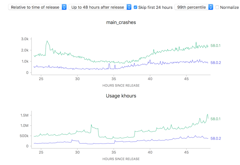
On the other hand, looking at raw counts doesn’t really give you much of a hint on how to interpret the results. Depending on the scale of the graph, the actual rates could actually resolve to being vastly different:
![]()
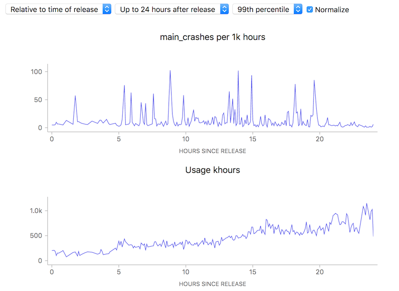
Ok, so this simple tool (using a ratio) is useful. Yay! Unfortunately, there is one case where using this technique can lead to a very deceptive visualization: when the number of samples is really small, a few outliers can give a really false impression of what’s really happening. Take this graph of what the crash rate looked like just after Firefox 58.0 was released:
![]()
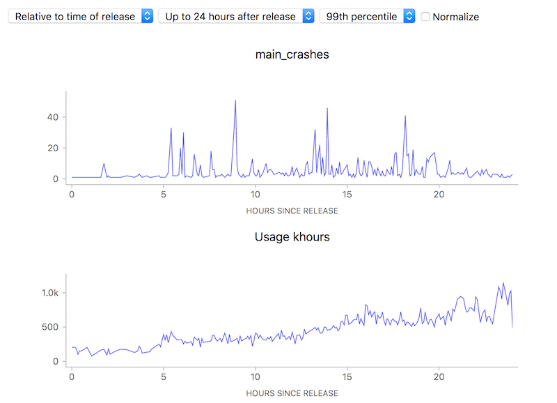
10 to 100 errors per 1000 hours, say it isn’t so? But wait, how many errors do we have absolutely? Hovering over a representative point in the graph with the normalization (use of a ratio) turned off:
![]()
We’re really only talking about something between 1 to 40 crashes events over a relatively small number of usage hours. This is clearly so little data that we can’t (and shouldn’t) draw any kind of conclusion whatsoever.
Ok, so that’s just science 101: don’t jump to conclusions based on small, vastly unrepresentative samples. Unfortunately due to human psychology people tend to assume that charts like this are authoritative and represent something real, absent an explanation otherwise — and the use of a ratio obscured the one fact (extreme lack of data) that would have given the user a hint on how to correctly interpret the results. Something to keep in mind as we build our tools.
Just a quick announcement that I’ve taken it upon myself to assume some maintership duties of the popular MetricsGraphics library and have released a new version with some bug fixes (2.12.0). We use this package pretty extensively at Mozilla for visualizing telemetry and other time series data, but its original authors (Hamilton Ulmer and Ali Almossawi) have mostly moved on to other things so there was a bit of a gap in getting fixes and improvements in that I hope to fill.
I don’t yet claim to be an expert in this library (which is quite rich and complex), but I’m sure I’ll learn more as I go along. At least initially, I expect that the changes I make will be small and primarily targetted to filling the needs of the Mission Control project.
Note that this emphatically does not mean I am promising to respond to every issue/question/pull request made against the project. Like my work with mozregression and perfherder, my maintenance work is being done on a best-effort basis to support Mozilla and the larger open source community. I’ll help people out where I can, but there are only so many working hours in a day and I need to spend most of those pushing my team’s immediate projects and deliverables forward! In particular, when it comes to getting pull requests merged, small, self-contained and logical changes with good commit messages will take priority.
Ok, after a series of posts extolling the virtues of my current project, it’s time to take a more critical look at some of its current limitations, and what we might do about them. In my introductory post, I talked about how Mission Control can let us know how “crashy” a new release is, within a short interval of it being released. I also alluded to the fact that things appear considerably worse when something first goes out, though I didn’t go into a lot of detail about how and why that happens.
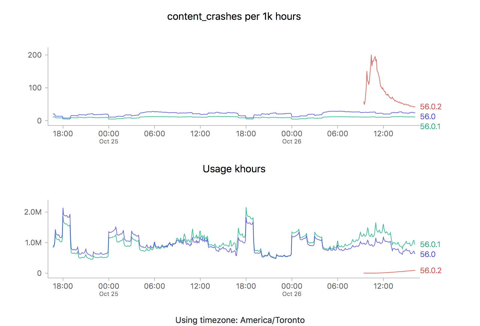
It just so happens that a new point release (56.0.2) just went out, so it’s a perfect opportunity to revisit this issue. Let’s take a look at what the graphs are saying (each of the images is also a link to the dashboard where they were generated):
![]()
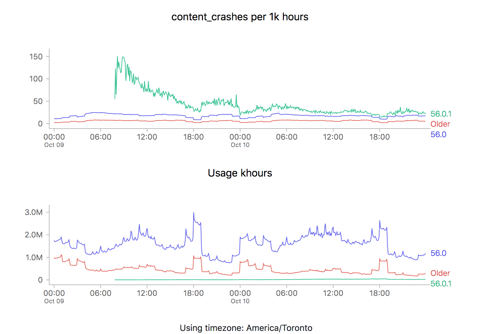
ZOMG! It looks like 56.0.2 is off the charts relative to the two previous releases (56.0 and 56.0.1). Is it time to sound the alarm? Mission control abort? Well, let’s see what happens the last time we rolled something new out, say 56.0.1:
![]()
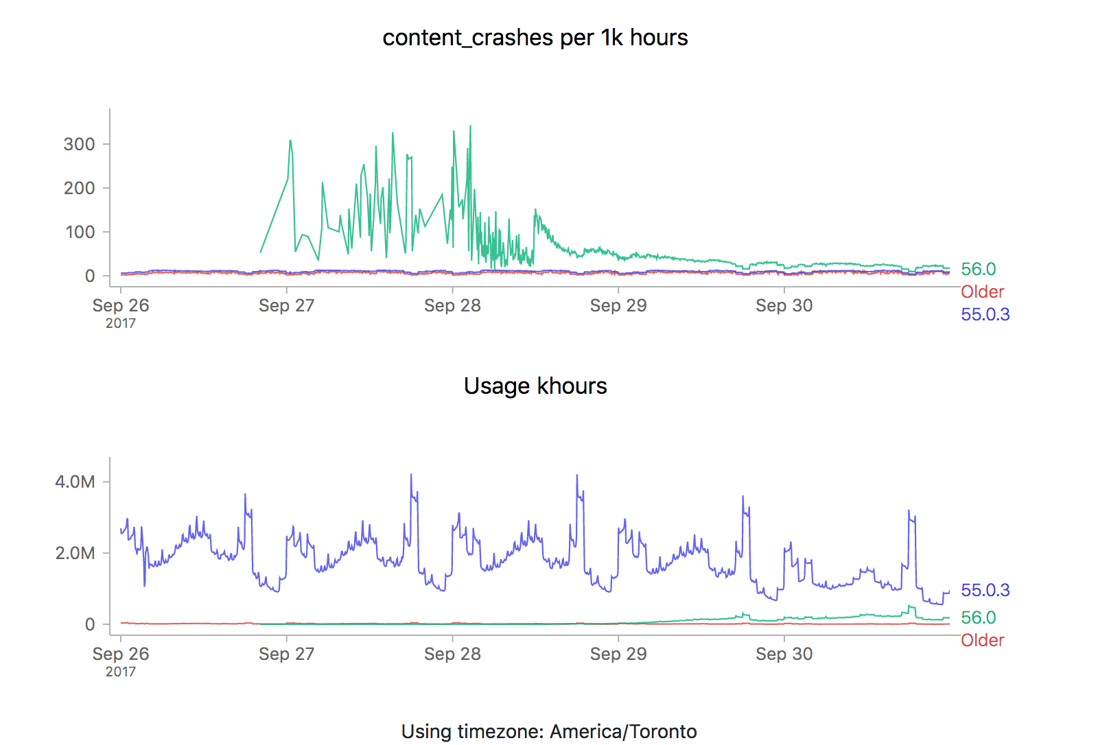
We see the exact same pattern. Hmm. How about 56.0?
![]()
Yep, same pattern here too (actually slightly worse).
What could be going on? Let’s start by reviewing what these time series graphs are based on. Each point on the graph represents the number of crashes reported by telemetry “main” pings corresponding to that channel/version/platform within a five minute interval, divided by the number of usage hours (how long users have had Firefox open) also reported in that interval. A main ping is submitted under a few circumstances:
- The user shuts down Firefox
- It’s been about 24 hours since the last time we sent a main ping.
- The user starts Firefox after Firefox failed to start properly
- The user changes something about Firefox’s environment (adds an addon, flips a user preference)
A high crash rate either means a larger number of crashes over the same number of usage hours, or a lower number of usage hours over the same number of crashes. There are several likely explanations for why we might see this type of crashy behaviour immediately after a new release:
- A Firefox update is applied after the user restarts their browser for any reason, including their browser crash. Thus a user whose browser crashes a lot (for any reason), is more prone to update to the latest version sooner than a user that doesn’t crash as much.
- Inherently, any crash data submitted to telemetry after a new version is released will have a low number of usage hours attached, because the client would not have had a chance to use it much (because it’s so new).
Assuming that we’re reasonably satisfied with the above explanation, there’s a few things we could try to do to correct for this situation when implementing an “alerting” system for mission control (the next item on my todo list for this project):
- Set “error” thresholds for each crash measure sufficiently high that we don’t consider these high initial values an error (i.e. only alert if there is are 500 crashes per 1k hours).
- Only trigger an error threshold when some kind of minimum quantity of usage hours has been observed (this has the disadvantage of potentially obscuring a serious problem until a large percentage of the user population is affected by it).
- Come up with some expected range of what we expect a value to be for when a new version of firefox is first released and ratchet that down as time goes on (according to some kind of model of our previous expectations).
The initial specification for this project called for just using raw thresholds for these measures (discounting usage hours), but I’m becoming increasingly convinced that won’t cut it. I’m not a quality control expert, but 500 crashes for 1k hours of use sounds completely unacceptable if we’re measuring things at all accurately (which I believe we are given a sufficient period of time). At the same time, generating 20–30 “alerts” every time a new release went out wouldn’t particularly helpful either. Once again, we’re going to have to do this the hard way…
—
If this sounds interesting and you have some react/d3/data visualization skills (or would like to gain some), learn about contributing to mission control.
Shout out to chutten for reviewing this post and providing feedback and additions.
One of the great design decisions that was made for Treeherder was a strict seperation of the client and server portions of the codebase. While its backend was moderately complicated to get up and running (especially into a state that looked at all like what we were running in production), you could get its web frontend running (pointed against the production data) just by starting up a simple node.js server. This dramatically lowered the barrier to entry, for Mozilla employees and casual contributors alike.
I knew right from the beginning that I wanted to take the same approach with Mission Control. While the full source of the project is available, unfortunately it isn’t presently possible to bring up the full stack with real data, as that requires privileged access to the athena/parquet error aggregates table. But since the UI is self-contained, it’s quite easy to bring up a development environment that allows you to freely browse the cached data which is stored server-side (essentially: git clone https://github.com/mozilla/missioncontrol.git && yarn install && yarn start).
In my experience, the most interesting problems when it comes to projects like these center around the question of how to present extremely complex data in a way that is intuitive but not misleading. Probably 90% of that work happens in the frontend. In the past, I’ve had pretty good luck finding contributors for my projects (especially Perfherder) by doing call-outs on this blog. So let it be known: If Mission Control sounds like an interesting project and you know React/Redux/D3/MetricsGraphics (or want to learn), let’s work together!
I’ve created some good first bugs to tackle in the github issue tracker. From there, I have a galaxy of other work in mind to improve and enhance the usefulness of this project. Please get in touch with me (wlach) on irc.mozilla.org #missioncontrol if you want to discuss further.
Time for an overdue post on the mission control project that I’ve been working on for the past few quarters, since I transitioned to the data platform team.
One of the gaps in our data story when it comes to Firefox is being able to see how a new release is doing in the immediate hours after release. Tools like crashstats and the telemetry evolution dashboard are great, but it can take many hours (if not days) before you can reliably see that there is an issue in a metric that we care about (number of crashes, say). This is just too long — such delays unnecessarily retard rolling out a release when it is safe (because there is a paranoia that there might be some lingering problem which we we’re waiting to see reported). And if, somehow, despite our abundant caution a problem did slip through it would take us some time to recognize it and roll out a fix.
Enter mission control. By hooking up a high-performance spark streaming job directly to our ingestion pipeline, we can now be able to detect within moments whether firefox is performing unacceptably within the field according to a particular measure.
To make the volume of data manageable, we create a grouped data set with the raw count of the various measures (e.g. main crashes, content crashes, slow script dialog counts) along with each unique combination of dimensions (e.g. platform, channel, release).
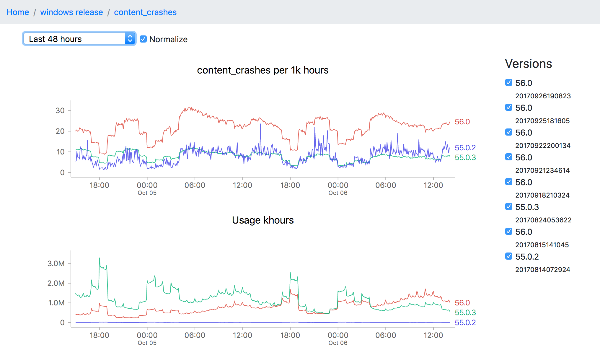
Of course, all this data is not so useful without a tool to visualize it, which is what I’ve been spending the majority of my time on. The idea is to be able to go from a top level description of what’s going on a particular channel (release for example) all the way down to a detailed view of how a measure has been performing over a time interval:
![]()
This particular screenshot shows the volume of content crashes (sampled every 5 minutes) over the last 48 hours on windows release. You’ll note that the later version (56.0) seems to be much crashier than earlier versions (55.0.3) which would seem to be a problem except that the populations are not directly comparable (since the profile of a user still on an older version of Firefox is rather different from that of one who has already upgraded). This is one of the still unsolved problems of this project: finding a reliable, automatable baseline of what an “acceptable result” for any particular measure might be.
Even still, the tool can still be useful for exploring a bunch of data quickly and it has been progressing rapidly over the last few weeks. And like almost everything Mozilla does, both the source and dashboard are open to the public. I’m planning on flagging some easier bugs for newer contributors to work on in the next couple weeks, but in the meantime if you’re interested in this project and want to get involved, feel free to look us up on irc.mozilla.org #missioncontrol (I’m there as ‘wlach’).