Derived versus direct
Feb 12th, 2018
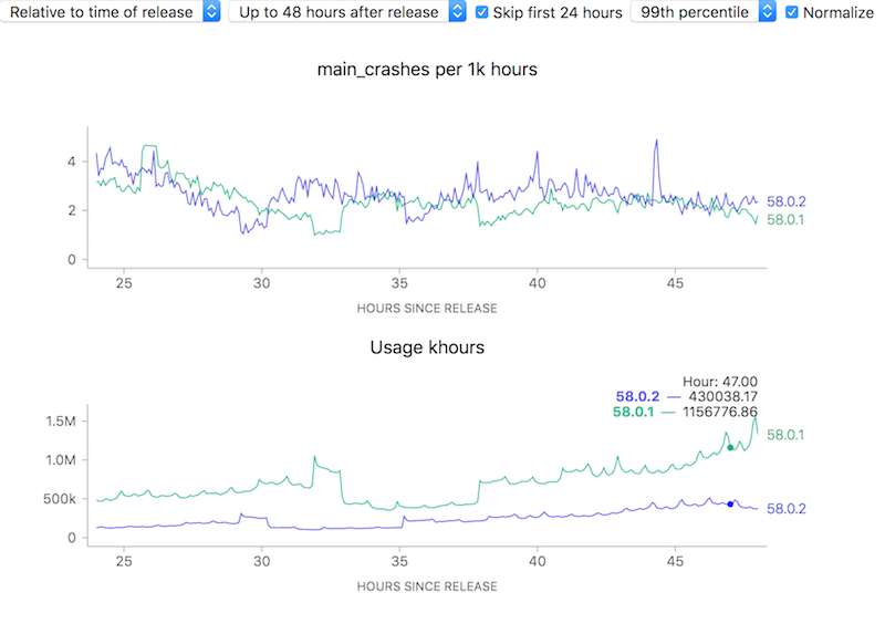
To attempt to make complex phenomena more understandable, we often use derived measures when representing Telemetry data at Mozilla. For error rates for example, we often measure things in terms of “X per khours of use” (where X might be “main crashes”, “appearance of the slow script dialogue”). I.e. instead of showing a raw count of errors we show a rate. Normally this is a good thing: it allows the user to easily compare two things which might have different raw numbers for whatever reason but where you’d normally expect the ratio to be similar. For example, we see that although the uptake of the newly-released Firefox 58.0.2 is a bit slower than 58.0.1, the overall crash rate (as sampled every 5 minutes) is more or less the same after about a day has rolled around:
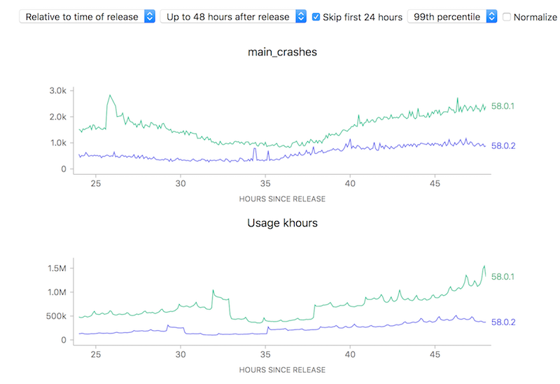
On the other hand, looking at raw counts doesn’t really give you much of a hint on how to interpret the results. Depending on the scale of the graph, the actual rates could actually resolve to being vastly different:
Ok, so this simple tool (using a ratio) is useful. Yay! Unfortunately, there is one case where using this technique can lead to a very deceptive visualization: when the number of samples is really small, a few outliers can give a really false impression of what’s really happening. Take this graph of what the crash rate looked like just after Firefox 58.0 was released:
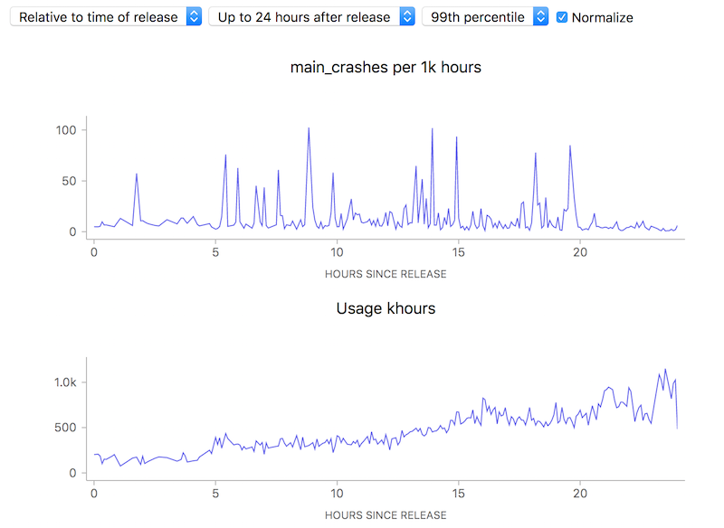
10 to 100 errors per 1000 hours, say it isn’t so? But wait, how many errors do we have absolutely? Hovering over a representative point in the graph with the normalization (use of a ratio) turned off:
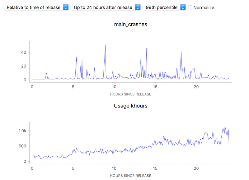
We’re really only talking about something between 1 to 40 crashes events over a relatively small number of usage hours. This is clearly so little data that we can’t (and shouldn’t) draw any kind of conclusion whatsoever.
Ok, so that’s just science 101: don’t jump to conclusions based on small, vastly unrepresentative samples. Unfortunately due to human psychology people tend to assume that charts like this are authoritative and represent something real, absent an explanation otherwise — and the use of a ratio obscured the one fact (extreme lack of data) that would have given the user a hint on how to correctly interpret the results. Something to keep in mind as we build our tools.