Showing posts tagged Data Visualization
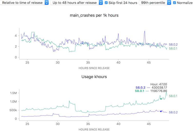
To attempt to make complex phenomena more understandable, we often use derived measures when representing Telemetry data at Mozilla. For error rates for example, we often measure things in terms of “X per khours of use” (where X might be “main crashes”, “appearance of the slow script dialogue”). I.e. instead of showing a raw count of errors we show a rate. Normally this is a good thing: it allows the user to easily compare two things which might have different raw numbers for whatever reason but where you’d normally expect the ratio to be similar. For example, we see that although the uptake of the newly-released Firefox 58.0.2 is a bit slower than 58.0.1, the overall crash rate (as sampled every 5 minutes) is more or less the same after about a day has rolled around:
![]()
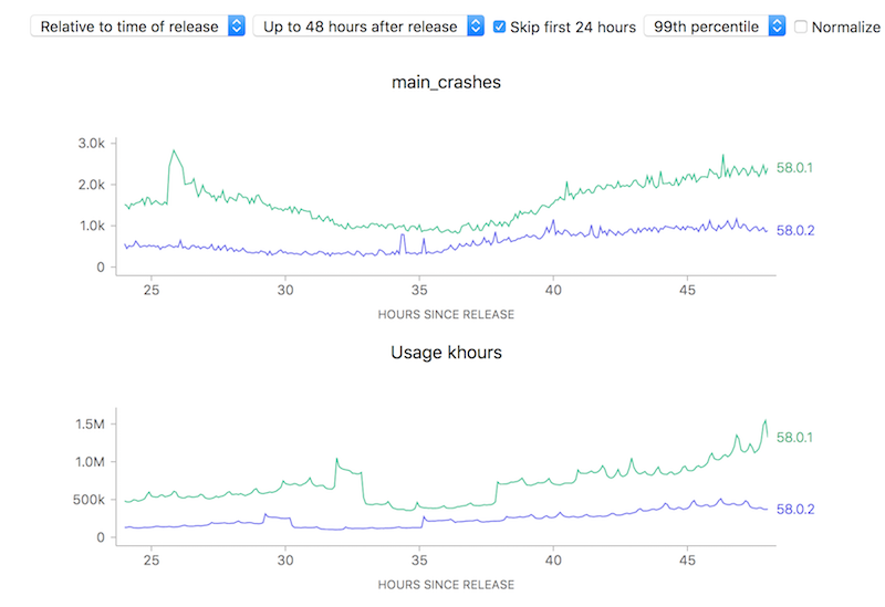
On the other hand, looking at raw counts doesn’t really give you much of a hint on how to interpret the results. Depending on the scale of the graph, the actual rates could actually resolve to being vastly different:
![]()
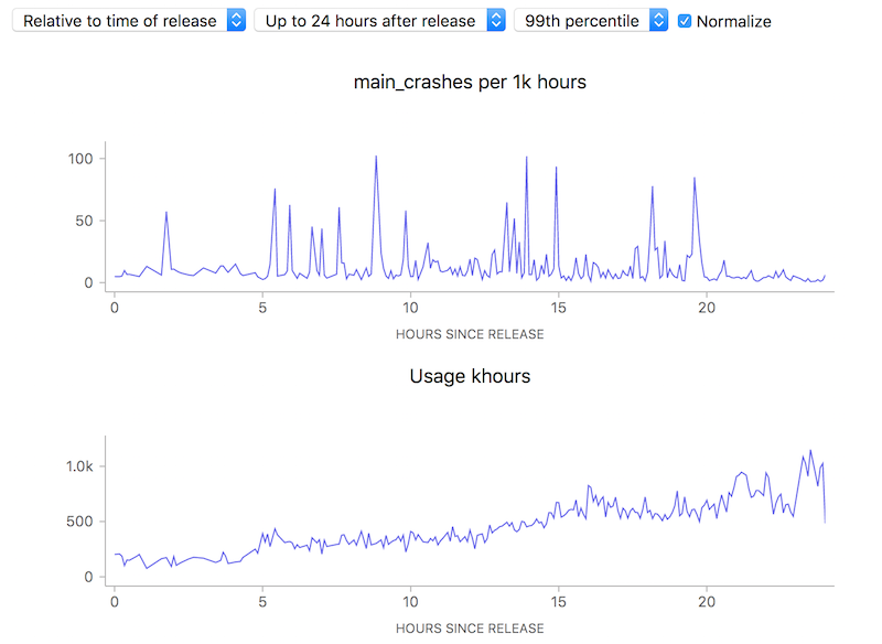
Ok, so this simple tool (using a ratio) is useful. Yay! Unfortunately, there is one case where using this technique can lead to a very deceptive visualization: when the number of samples is really small, a few outliers can give a really false impression of what’s really happening. Take this graph of what the crash rate looked like just after Firefox 58.0 was released:
![]()
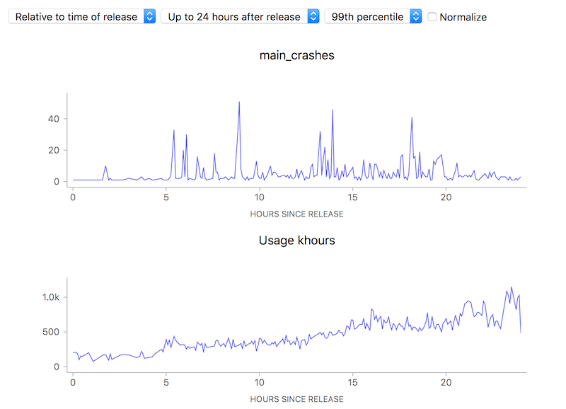
10 to 100 errors per 1000 hours, say it isn’t so? But wait, how many errors do we have absolutely? Hovering over a representative point in the graph with the normalization (use of a ratio) turned off:
![]()
We’re really only talking about something between 1 to 40 crashes events over a relatively small number of usage hours. This is clearly so little data that we can’t (and shouldn’t) draw any kind of conclusion whatsoever.
Ok, so that’s just science 101: don’t jump to conclusions based on small, vastly unrepresentative samples. Unfortunately due to human psychology people tend to assume that charts like this are authoritative and represent something real, absent an explanation otherwise — and the use of a ratio obscured the one fact (extreme lack of data) that would have given the user a hint on how to correctly interpret the results. Something to keep in mind as we build our tools.
Ok, after a series of posts extolling the virtues of my current project, it’s time to take a more critical look at some of its current limitations, and what we might do about them. In my introductory post, I talked about how Mission Control can let us know how “crashy” a new release is, within a short interval of it being released. I also alluded to the fact that things appear considerably worse when something first goes out, though I didn’t go into a lot of detail about how and why that happens.
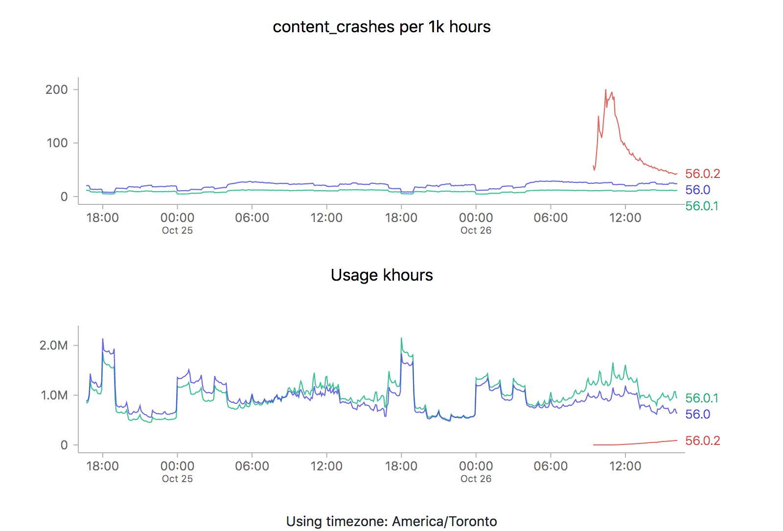
It just so happens that a new point release (56.0.2) just went out, so it’s a perfect opportunity to revisit this issue. Let’s take a look at what the graphs are saying (each of the images is also a link to the dashboard where they were generated):
![]()
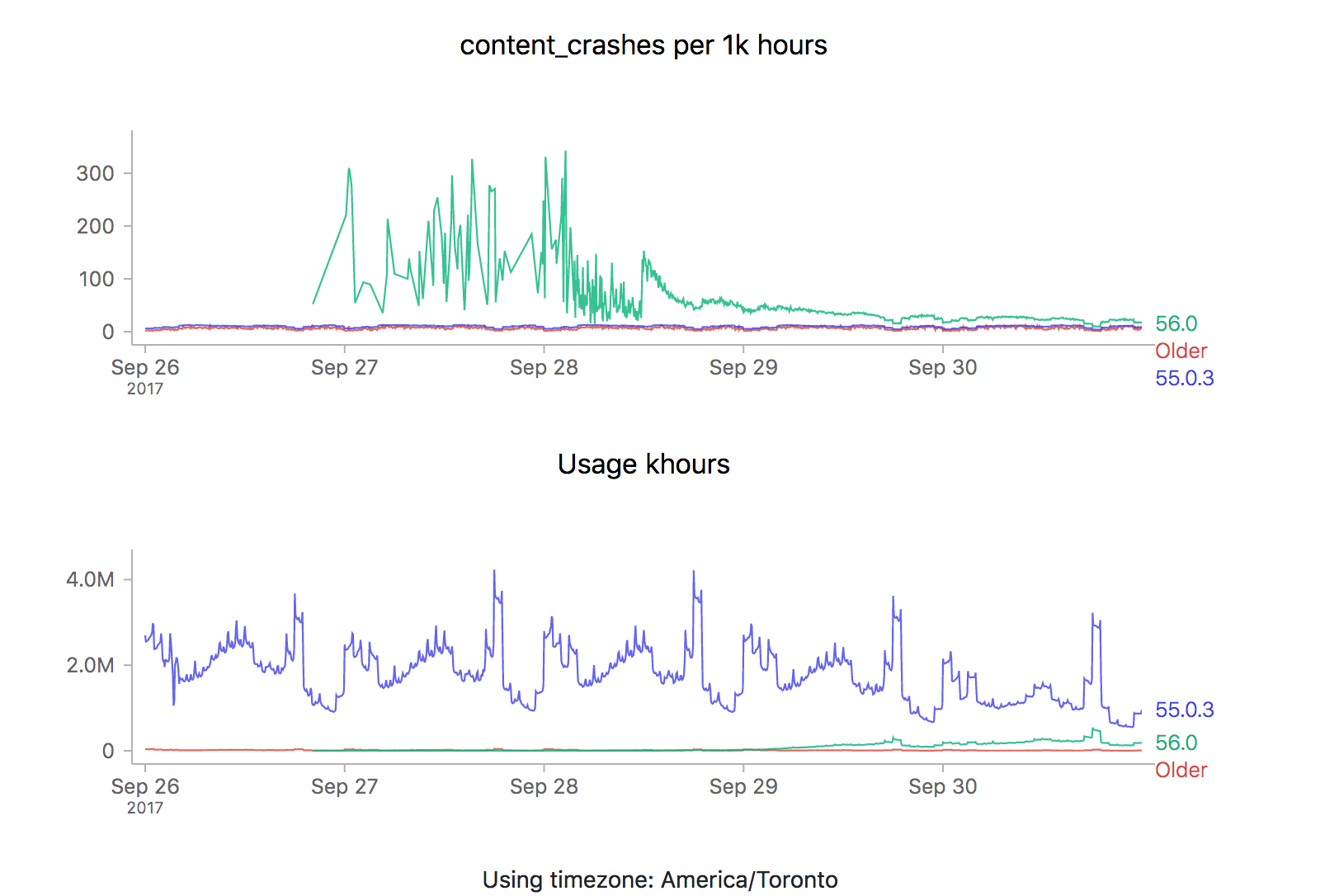
ZOMG! It looks like 56.0.2 is off the charts relative to the two previous releases (56.0 and 56.0.1). Is it time to sound the alarm? Mission control abort? Well, let’s see what happens the last time we rolled something new out, say 56.0.1:
![]()
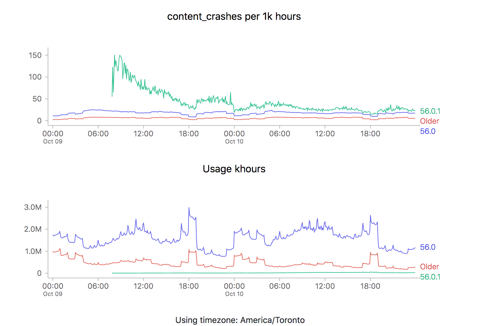
We see the exact same pattern. Hmm. How about 56.0?
![]()
Yep, same pattern here too (actually slightly worse).
What could be going on? Let’s start by reviewing what these time series graphs are based on. Each point on the graph represents the number of crashes reported by telemetry “main” pings corresponding to that channel/version/platform within a five minute interval, divided by the number of usage hours (how long users have had Firefox open) also reported in that interval. A main ping is submitted under a few circumstances:
- The user shuts down Firefox
- It’s been about 24 hours since the last time we sent a main ping.
- The user starts Firefox after Firefox failed to start properly
- The user changes something about Firefox’s environment (adds an addon, flips a user preference)
A high crash rate either means a larger number of crashes over the same number of usage hours, or a lower number of usage hours over the same number of crashes. There are several likely explanations for why we might see this type of crashy behaviour immediately after a new release:
- A Firefox update is applied after the user restarts their browser for any reason, including their browser crash. Thus a user whose browser crashes a lot (for any reason), is more prone to update to the latest version sooner than a user that doesn’t crash as much.
- Inherently, any crash data submitted to telemetry after a new version is released will have a low number of usage hours attached, because the client would not have had a chance to use it much (because it’s so new).
Assuming that we’re reasonably satisfied with the above explanation, there’s a few things we could try to do to correct for this situation when implementing an “alerting” system for mission control (the next item on my todo list for this project):
- Set “error” thresholds for each crash measure sufficiently high that we don’t consider these high initial values an error (i.e. only alert if there is are 500 crashes per 1k hours).
- Only trigger an error threshold when some kind of minimum quantity of usage hours has been observed (this has the disadvantage of potentially obscuring a serious problem until a large percentage of the user population is affected by it).
- Come up with some expected range of what we expect a value to be for when a new version of firefox is first released and ratchet that down as time goes on (according to some kind of model of our previous expectations).
The initial specification for this project called for just using raw thresholds for these measures (discounting usage hours), but I’m becoming increasingly convinced that won’t cut it. I’m not a quality control expert, but 500 crashes for 1k hours of use sounds completely unacceptable if we’re measuring things at all accurately (which I believe we are given a sufficient period of time). At the same time, generating 20–30 “alerts” every time a new release went out wouldn’t particularly helpful either. Once again, we’re going to have to do this the hard way…
—
If this sounds interesting and you have some react/d3/data visualization skills (or would like to gain some), learn about contributing to mission control.
Shout out to chutten for reviewing this post and providing feedback and additions.
One of the great design decisions that was made for Treeherder was a strict seperation of the client and server portions of the codebase. While its backend was moderately complicated to get up and running (especially into a state that looked at all like what we were running in production), you could get its web frontend running (pointed against the production data) just by starting up a simple node.js server. This dramatically lowered the barrier to entry, for Mozilla employees and casual contributors alike.
I knew right from the beginning that I wanted to take the same approach with Mission Control. While the full source of the project is available, unfortunately it isn’t presently possible to bring up the full stack with real data, as that requires privileged access to the athena/parquet error aggregates table. But since the UI is self-contained, it’s quite easy to bring up a development environment that allows you to freely browse the cached data which is stored server-side (essentially: git clone https://github.com/mozilla/missioncontrol.git && yarn install && yarn start).
In my experience, the most interesting problems when it comes to projects like these center around the question of how to present extremely complex data in a way that is intuitive but not misleading. Probably 90% of that work happens in the frontend. In the past, I’ve had pretty good luck finding contributors for my projects (especially Perfherder) by doing call-outs on this blog. So let it be known: If Mission Control sounds like an interesting project and you know React/Redux/D3/MetricsGraphics (or want to learn), let’s work together!
I’ve created some good first bugs to tackle in the github issue tracker. From there, I have a galaxy of other work in mind to improve and enhance the usefulness of this project. Please get in touch with me (wlach) on irc.mozilla.org #missioncontrol if you want to discuss further.
Time for an overdue post on the mission control project that I’ve been working on for the past few quarters, since I transitioned to the data platform team.
One of the gaps in our data story when it comes to Firefox is being able to see how a new release is doing in the immediate hours after release. Tools like crashstats and the telemetry evolution dashboard are great, but it can take many hours (if not days) before you can reliably see that there is an issue in a metric that we care about (number of crashes, say). This is just too long — such delays unnecessarily retard rolling out a release when it is safe (because there is a paranoia that there might be some lingering problem which we we’re waiting to see reported). And if, somehow, despite our abundant caution a problem did slip through it would take us some time to recognize it and roll out a fix.
Enter mission control. By hooking up a high-performance spark streaming job directly to our ingestion pipeline, we can now be able to detect within moments whether firefox is performing unacceptably within the field according to a particular measure.
To make the volume of data manageable, we create a grouped data set with the raw count of the various measures (e.g. main crashes, content crashes, slow script dialog counts) along with each unique combination of dimensions (e.g. platform, channel, release).
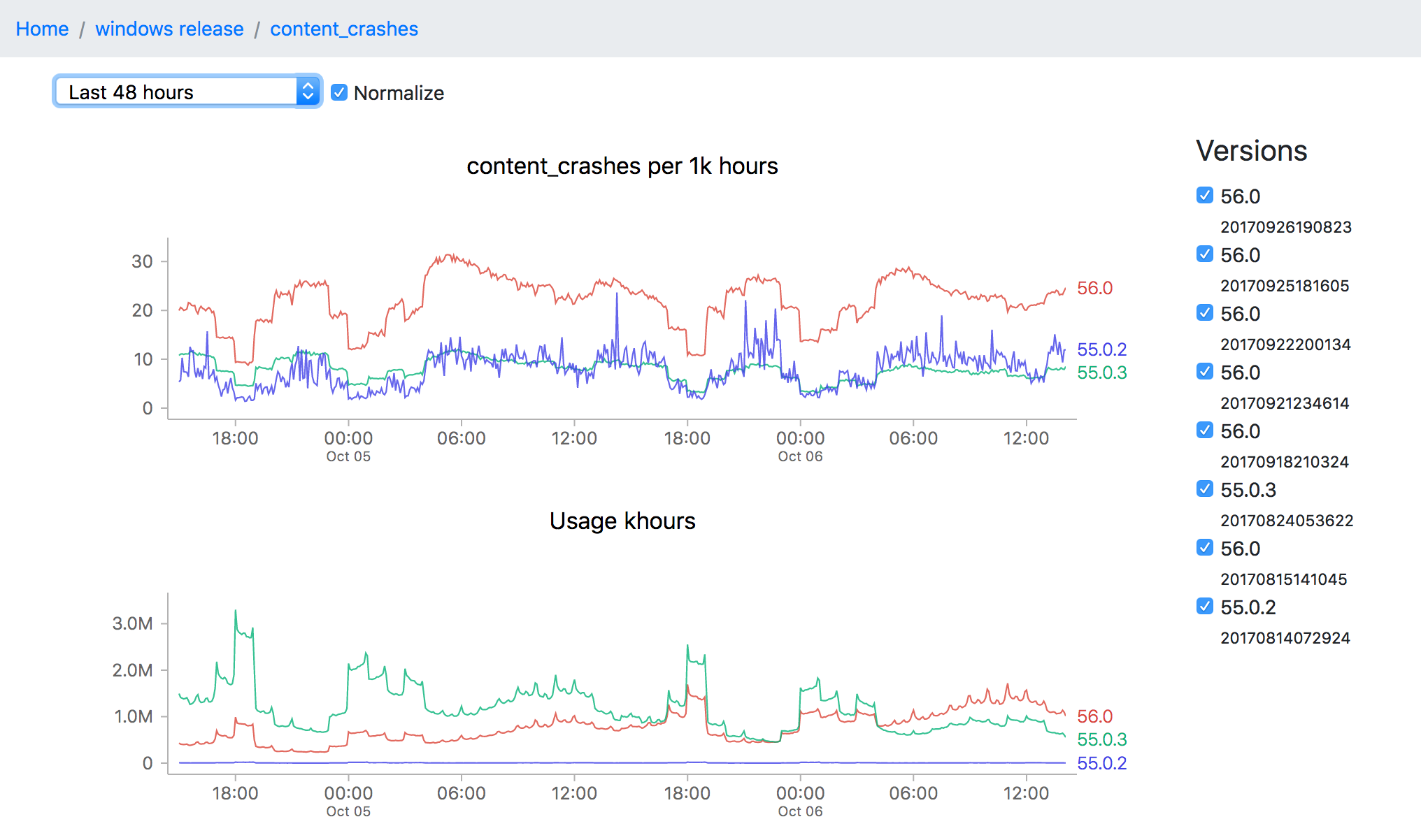
Of course, all this data is not so useful without a tool to visualize it, which is what I’ve been spending the majority of my time on. The idea is to be able to go from a top level description of what’s going on a particular channel (release for example) all the way down to a detailed view of how a measure has been performing over a time interval:
![]()
This particular screenshot shows the volume of content crashes (sampled every 5 minutes) over the last 48 hours on windows release. You’ll note that the later version (56.0) seems to be much crashier than earlier versions (55.0.3) which would seem to be a problem except that the populations are not directly comparable (since the profile of a user still on an older version of Firefox is rather different from that of one who has already upgraded). This is one of the still unsolved problems of this project: finding a reliable, automatable baseline of what an “acceptable result” for any particular measure might be.
Even still, the tool can still be useful for exploring a bunch of data quickly and it has been progressing rapidly over the last few weeks. And like almost everything Mozilla does, both the source and dashboard are open to the public. I’m planning on flagging some easier bugs for newer contributors to work on in the next couple weeks, but in the meantime if you’re interested in this project and want to get involved, feel free to look us up on irc.mozilla.org #missioncontrol (I’m there as ‘wlach’).
Since my last update, we’ve been trucking along with improvements to Perfherder, the project for making Firefox performance sheriffing and analysis easier.
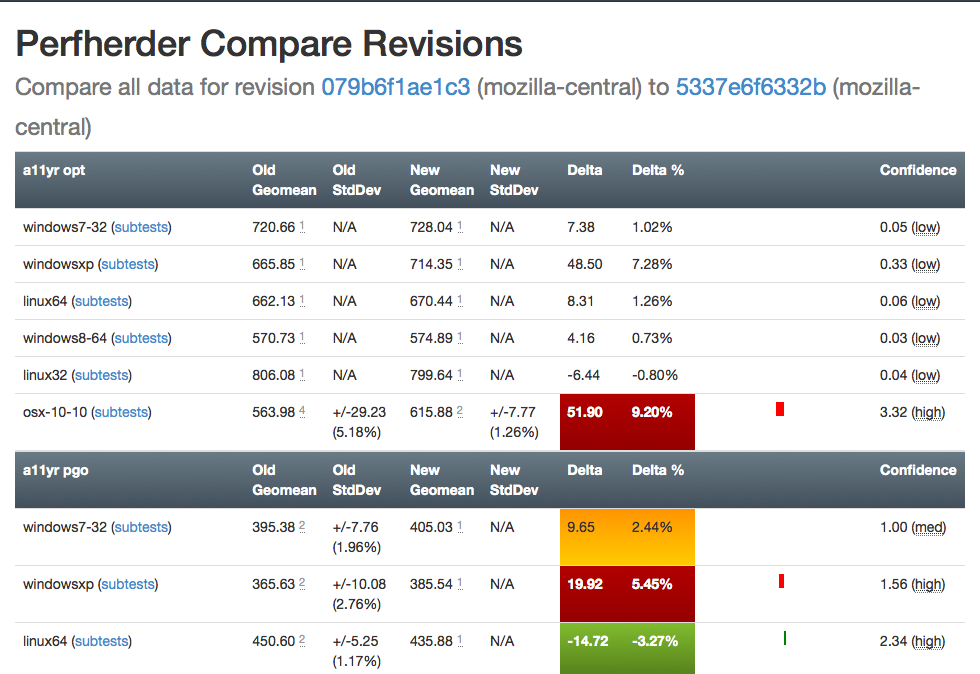
Compare visualization improvements
I’ve been spending quite a bit of time trying to fix up the display of information in the compare view, to address feedback from developers and hopefully generally streamline things. Vladan (from the perf team) referred me to Blake Winton, who provided tons of awesome suggestions on how to present things more concisely.
Here’s an old versus new picture:
Summary of significant changes in this view:
- Removed or consolidated several types of numerical information which were overwhelming or confusing (e.g. presenting both numerical and percentage standard deviation in their own columns).
- Added tooltips all over the place to explain what’s being displayed.
- Highlight more strongly when it appears there aren’t enough runs to make a definitive determination on whether there was a regression or improvement.
- Improve display of visual indicator of magnitude of regression/improvement (providing a pseudo-scale showing where the change ranges from 0% : 20%+).
- Provide more detail on the two changesets being compared in the header and make it easier to retrigger them (thanks to Mike Ling).
- Much better and more intuitive error handling when something goes wrong (also thanks to Mike Ling).
The point of these changes isn’t necessarily to make everything “immediately obvious” to people. We’re not building general purpose software here: Perfherder will always be a rather specialized tool which presumes significant domain knowledge on the part of the people using it. However, even for our audience, it turns out that there’s a lot of room to improve how our presentation: reducing the amount of extraneous noise helps people zero in on the things they really need to care about.
Special thanks to everyone who took time out of their schedules to provide so much good feedback, in particular Avi Halmachi, Glandium, and Joel Maher.
Of course more suggestions are always welcome. Please give it a try and file bugs against the perfherder component if you find anything you’d like to see changed or improved.
Getting the word out
Hammersmith:mozilla-central wlach$ hg push -f try
pushing to ssh://hg.mozilla.org/try
no revisions specified to push; using . to avoid pushing multiple heads
searching for changes
remote: waiting for lock on repository /repo/hg/mozilla/try held by 'hgssh1.dmz.scl3.mozilla.com:8270'
remote: got lock after 4 seconds
remote: adding changesets
remote: adding manifests
remote: adding file changes
remote: added 1 changesets with 1 changes to 1 files
remote: Trying to insert into pushlog.
remote: Inserted into the pushlog db successfully.
remote:
remote: View your change here:
remote:   https://hg.mozilla.org/try/rev/e0aa56fb4ace
remote:
remote: Follow the progress of your build on Treeherder:
remote:   https://treeherder.mozilla.org/#/jobs?repo=try&revision=e0aa56fb4ace
remote:
remote: It looks like this try push has talos jobs. Compare performance against a baseline revision:
remote:   https://treeherder.mozilla.org/perf.html#/comparechooser?newProject=try&newRevision=e0aa56fb4ace
Try pushes incorporating Talos jobs now automatically link to perfherder’s compare view, both in the output from mercurial and in the emails the system sends. One of the challenges we’ve been facing up to this point is just letting developers know that Perfherder exists and it can help them either avoid or resolve performance regressions. I believe this will help.
Data quality and ingestion improvements
Over the past couple weeks, we’ve been comparing our regression detection code when run against Graphserver data to Perfherder data. In doing so, we discovered that we’ve sometimes been using the wrong algorithm (geometric mean) to summarize some of our tests, leading to unexpected and less meaningful results. For example, the v8_7 benchmark uses a custom weighting algorithm for its score, to account for the fact that the things it tests have a particular range of expected values.
To hopefully prevent this from happening again in the future, we’ve decided to move the test summarization code out of Perfherder back into Talos (bug 1184966). This has the additional benefit of creating a stronger connection between the content of the Talos logs and what Perfherder displays in its comparison and graph views, which has thrown people off in the past.
Continuing data challenges
Having better tools for visualizing this stuff is great, but it also highlights some continuing problems we’ve had with data quality. It turns out that our automation setup often produces qualitatively different performance results for the exact same set of data, depending on when and how the tests are run.
A certain amount of random noise is always expected when running performance tests. As much as we might try to make them uniform, our testing machines and environments are just not 100% identical. That we expect and can deal with: our standard approach is just to retrigger runs, to make sure we get a representative sample of data from our population of machines.
The problem comes when there’s a pattern to the noise: we’ve already noticed that tests run on the weekends produce different results (see Joel’s post from a year ago, “A case of the weekends”) but it seems as if there’s other circumstances where one set of results will be different from another, depending on the time that each set of tests was run. Some tests and platforms (e.g. the a11yr suite, MacOS X 10.10) seem particularly susceptible to this issue.
We need to find better ways of dealing with this problem, as it can result in a lot of wasted time and energy, for both sheriffs and developers. See for example bug 1190877, which concerned a completely spurious regression on the tresize benchmark that was initially blamed on some changes to the media code: in this case, Joel speculates that the linux64 test machines we use might have changed from under us in some way, but we really don’t know yet.
I see two approaches possible here:
- Figure out what’s causing the same machines to produce qualitatively different result distributions and address that. This is of course the ideal solution, but it requires coordination with other parts of the organization who are likely quite busy and might be hard.
- Figure out better ways of detecting and managing these sorts of case. I have noticed that the standard deviation inside the results when we have spurious regressions/improvements tends to be higher (see for example this compare view for the aforementioned “regression”). Knowing what we do, maybe there’s some statistical methods we can use to detect bad data?
For now, I’m leaning towards (2). I don’t think we’ll ever completely solve this problem and I think coming up with better approaches to understanding and managing it will pay the largest dividends. Open to other opinions of course!
Was feeling a bit restless today, so I decided to build something on a theme I’d been thinking of since, oh gosh, I guess high school — an ecosystem simulation.
My original concept for it had three different types of entities — grass, rabbits, and foxes wandering around in a fixed environment. Each would eat the previous and try to reproduce. Both the rabbits and foxes need to continually eat to survive, otherwise they will die. The grass will just grow unprompted. I think I may have picked up the idea from elsewhere, but am not sure (it’s been nearly 17 years after all).
I suppose the urge to do this comes from my fascination with the concepts of birth, death, and rebirth. Conway’s game of life is probably the most famous computer representation of this sort of theme, but I always found the behavior slightly too contrived and simple to be deeply satisfying to me (at least from the point of view of representing this concept: the game is certainly interesting for other reasons). Conway’s simulation is completely deterministic and only has one type of entity, the cell. There’s an element of randomness and hierarchy in the real world, and I wanted to represent these somehow.
It was remarkably easy to get things going using my preferred toolkit for these things (Javascript and Canvas) — about 3 hours to get something on the screen, then a bunch of tweaking until I found the behavior I wanted. Either I’m getting smarter or the tools to build these things are getting better. Probably the latter.
In the end, I only wound up having rabbits and grass in my simulation in this iteration and went for a very abstract representation of what was going on (colored squares for everything!). It turns out that no more than that was really necessary to create something that held my interest. Here’s a screenshot (doesn’t really do it justice):
If you’d like to check it out for yourself, I put a copy on my website here. It probably requires a fairly fancy computer to run at a decent speed (I built it using a 2014 MacBook Pro and made very little effort to optimize it). If that doesn’t work out for you, I put up a video capture of the simulation on youtube.
The math and programming behind the simulation is completely arbitrary and anything but rigorous. There are probably a bunch of bugs and unintended behaviors. This has all probably been done a million times before by people I’ve never met and never will. I’m ok with that.
Update: Source now on github, for those who want to play with it and submit pull requests.
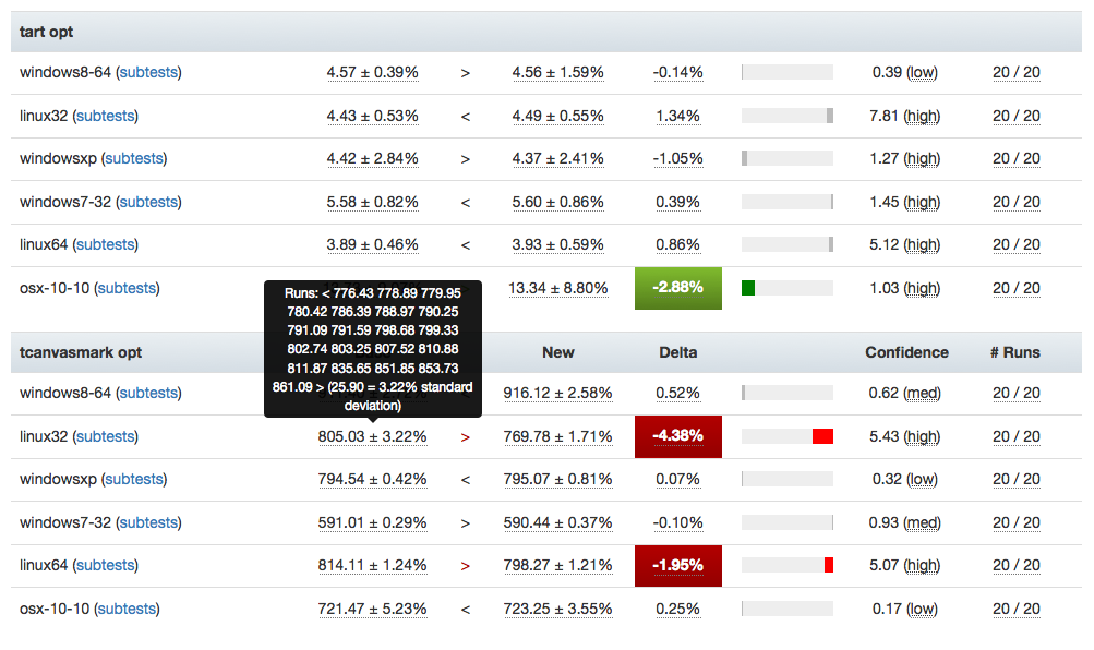
Just wanted to give another quick Perfherder update. Since the last time, I’ve added summary series (which is what GraphServer shows you), so we now have (in theory) the best of both worlds when it comes to Talos data: aggregate summaries of the various suites we run (tp5, tart, etc), with the ability to dig into individual results as needed. This kind of analysis wasn’t possible with Graphserver and I’m hopeful this will be helpful in tracking down the root causes of Talos regressions more effectively.
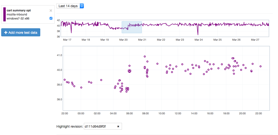
Let’s give an example of where this might be useful by showing how it can highlight problems. Recently we tracked a regression in the Customization Animation Tests (CART) suite from the commit in bug 1128354. Using Mishra Vikas‘s new “highlight revision mode” in Perfherder (combined with the revision hash when the regression was pushed to inbound), we can quickly zero in on the location of it:
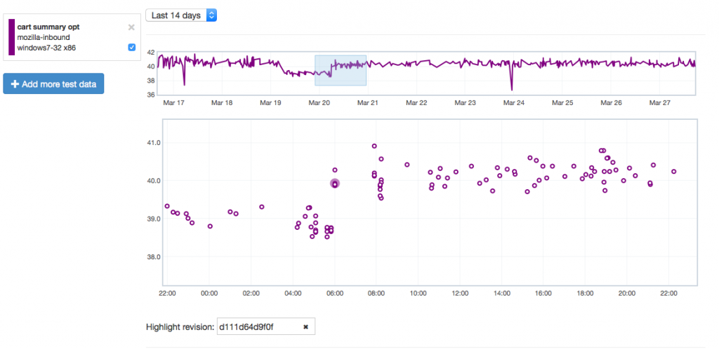
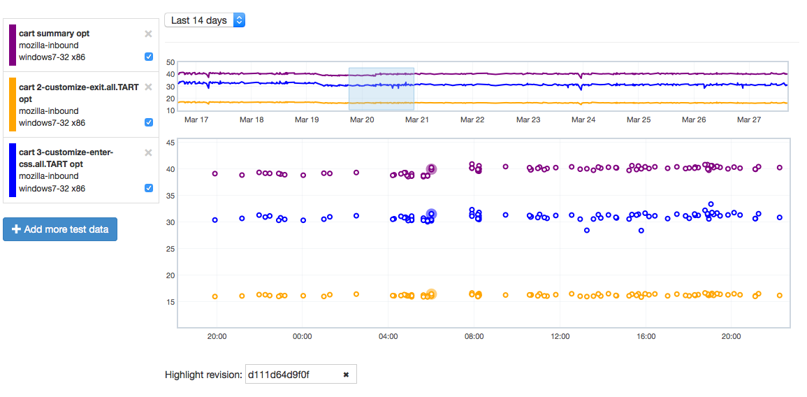
It does indeed look like things ticked up after this commit for the CART suite, but why? By clicking on the datapoint, you can open up a subtest summary view beneath the graph:
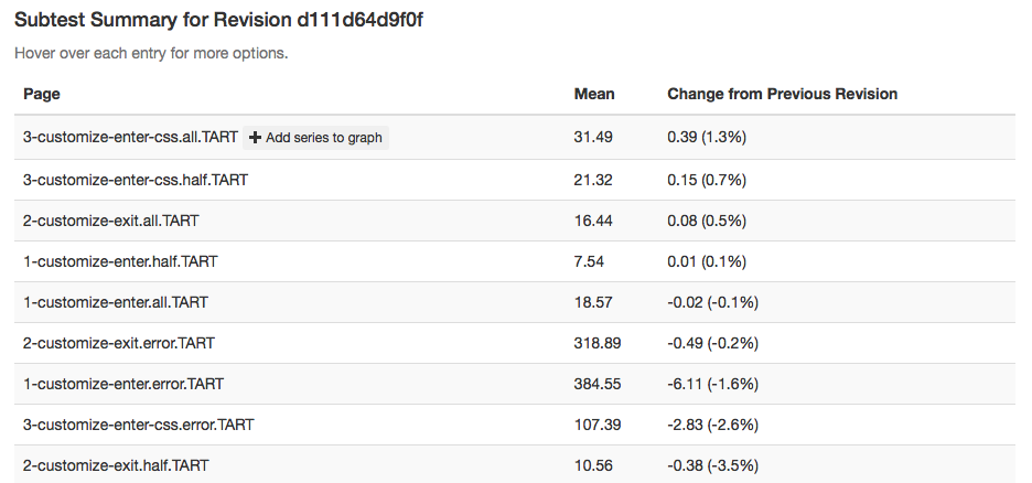
We see here that it looks like the 3-customize-enter-css.all.TART entry ticked up a bunch. The related test 3-customize-enter-css.half.TART ticked up a bit too. The changes elsewhere look minimal. But is that a trend that holds across the data over time? We can add some of the relevant subtests to the overall graph view to get a closer look:

As is hopefully obvious, this confirms that the affected subtest continues to hold its higher value while another test just bounces around more or less in the range it was before.
Hope people find this useful! If you want to play with this yourself, you can access the perfherder UI at http://treeherder.mozilla.org/perf.html.
[ For more information on the Eideticker software I’m referring to, see this entry ]
So recently I’ve been exploring new and different methods of measuring things that we care about on FirefoxOS — like startup time or amount of checkerboarding. With Android, where we have a mostly clean signal, these measurements were pretty straightforward. Want to measure startup times? Just capture a video of Firefox starting, then compare the frames pixel by pixel to see how much they differ. When the pixels aren’t that different anymore, we’re “done”. Likewise, to measure checkerboarding we just calculated the areas of the screen where things were not completely drawn yet, frame-by-frame.
On FirefoxOS, where we’re using a camera to measure these things, it has not been so simple. I’ve already discussed this with respect to startup time in a previous post. One of the ideas I talk about there is “entropy” (or the amount of unique information in the frame). It turns out that this is a pretty deep concept, and is useful for even more things than I thought of at the time. Since this is probably a concept that people are going to be thinking/talking about for a while, it’s worth going into a little more detail about the math behind it.
The wikipedia article on information theoretic entropy is a pretty good introduction. You should read it. It all boils down to this formula:

You can see this section of the wikipedia article (and the various articles that it links to) if you want to break down where that comes from, but the short answer is that given a set of random samples, the more different values there are, the higher the entropy will be. Look at it from a probabilistic point of view: if you take a random set of data and want to make predictions on what future data will look like. If it is highly random, it will be harder to predict what comes next. Conversely, if it is more uniform it is easier to predict what form it will take.
Another, possibly more accessible way of thinking about the entropy of a given set of data would be “how well would it compress?”. For example, a bitmap image with nothing but black in it could compress very well as there’s essentially only 1 piece of unique information in it repeated many times — the black pixel. On the other hand, a bitmap image of completely randomly generated pixels would probably compress very badly, as almost every pixel represents several dimensions of unique information. For all the statistics terminology, etc. that’s all the above formula is trying to say.
So we have a model of entropy, now what? For Eideticker, the question is — how can we break the frame data we’re gathering down into a form that’s amenable to this kind of analysis? The approach I took (on the recommendation of this article) was to create a histogram with 256 bins (representing the number of distinct possibilities in a black & white capture) out of all the pixels in the frame, then run the formula over that. The exact function I wound up using looks like this:
def _get_frame_entropy((i, capture, sobelized)):
    frame = capture.get_frame(i, True).astype('float')
    if sobelized:
        frame = ndimage.median_filter(frame, 3)

        dx = ndimage.sobel(frame, 0)  # horizontal derivative
        dy = ndimage.sobel(frame, 1)  # vertical derivative
        frame = numpy.hypot(dx, dy)  # magnitude
        frame *= 255.0 / numpy.max(frame)  # normalize (Q&D)

    histogram = numpy.histogram(frame, bins=256)[0]
    histogram_length = sum(histogram)
    samples_probability = [float(h) / histogram_length for h in histogram]
    entropy = -sum([p * math.log(p, 2) for p in samples_probability if p != 0])

    return entropy
[Context]
The “sobelized” bit allows us to optionally convolve the frame with a sobel filter before running the entropy calculation, which removes most of the data in the capture except for the edges. This is especially useful for FirefoxOS, where the signal has quite a bit of random noise from ambient lighting that artificially inflate the entropy values even in places where there is little actual “information”.
This type of transformation often reveals very interesting information about what’s going on in an eideticker test. For example, take this video of the user panning down in the contacts app:
If you graph the entropies of the frame of the capture using the formula above you, you get a graph like this:
[Link to original]
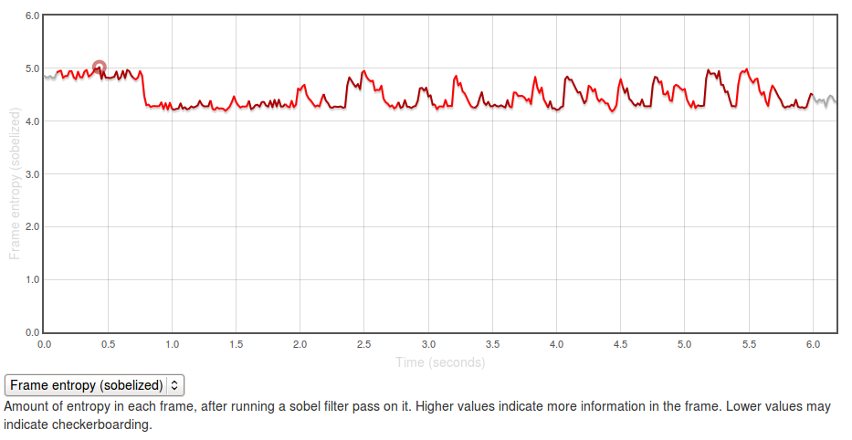
The Y axis represents entropy, as calculated by the code above. There is no inherently “right” value for this — it all depends on the application you’re testing and what you expect to see displayed on the screen. In general though, higher values are better as it indicates more frames of the capture are “complete”.
The region at the beginning where it is at about 5.0 represents the contacts app with a set of contacts fully displayed (at startup). The “flat” regions where the entropy is at roughly 4.25? Those are the areas where the app is “checkerboarding” (blanking out waiting for graphics or layout engine to draw contact information). Click through to the original and swipe over the graph to see what I mean.
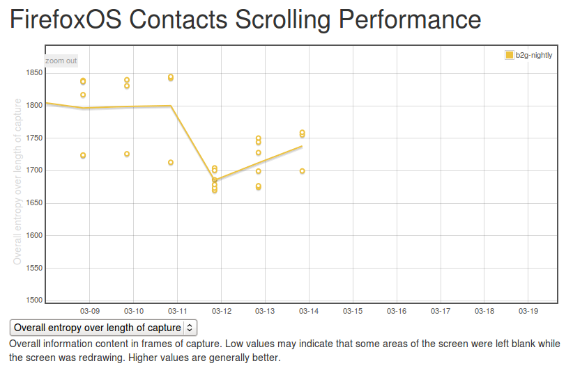
It’s easy to see what a hypothetical ideal end state would be for this capture: a graph with a smooth entropy of about 5.0 (similar to the start state, where all contacts are fully drawn in). We can track our progress towards this goal (or our deviation from it), by watching the eideticker b2g dashboard and seeing if the summation of the entropy values for frames over the entire test increases or decreases over time. If we see it generally increase, that probably means we’re seeing less checkerboarding in the capture. If we see it decrease, that might mean we’re now seeing checkerboarding where we weren’t before.
It’s too early to say for sure, but over the past few days the trend has been positive:
[Link to original]
(note that there were some problems in the way the tests were being run before, so results before the 12th should not be considered valid)
So one concept, at least two relevant metrics we can measure with it (startup time and checkerboarding). Are there any more? Almost certainly, let’s find them!
So we’ve been using Eideticker to automatically measure startup/pageload times for about a year now on Android, and more recently on FirefoxOS as well (albeit not automatically). This gives us nice and pretty graphs like this:
Ok, so we’re generating numbers and graphing them. That’s great. But what’s really going on behind the scenes? I’m glad you asked. The story is a bit different depending on which platform you’re talking about.
Android
On Android we connect Eideticker to the device’s HDMI out, so we count on a nearly pixel-perfect signal. In practice, it isn’t quite, but it is within a few RGB values that we can easily filter for. This lets us come up with a pretty good mechanism for determining when a page load or app startup is finished: just compare frames, and say we’ve “stopped” when the pixel differences between frames are negligible (previously defined at 2048 pixels, now 4096 — see below). Eideticker’s new frame difference view lets us see how this works. Look at this graph of application startup:
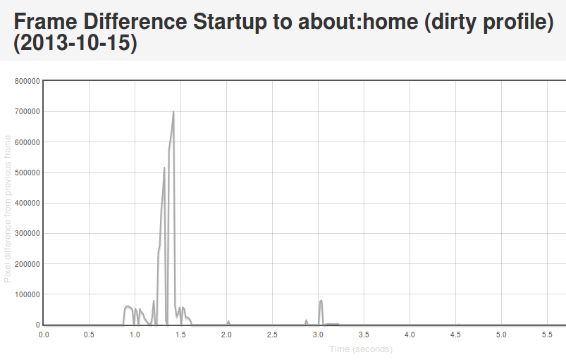
[Link to original]
What’s going on here? Well, we see some huge jumps in the beginning. This represents the animated transitions that Android makes as we transition from the SUTAgent application (don’t ask) to the beginnings of the FirefoxOS browser chrome. You’ll notice though that there’s some more changes that come in around the 3 second mark. This is when the site bookmarks are fully loaded. If you load the original page (link above) and swipe your mouse over the graph, you can see what’s going on for yourself.
This approach is not completely without problems. It turns out that there is sometimes some minor churn in the display even when the app is for all intents and purposes started. For example, sometimes the scrollbar fading out of view can result in a significantish pixel value change, so I recently upped the threshold of pixels that are different from 2048 to 4096. We also recently encountered a silly problem with a random automation app displaying “toasts” which caused results to artificially spike. More tweaking may still be required. However, on the whole I’m pretty happy with this solution. It gives useful, undeniably objective results whose meaning is easy to understand.
FirefoxOS
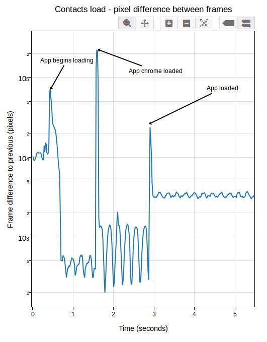
So as mentioned previously, we use a camera on FirefoxOS to record output instead of HDMI output. Pretty unsurprisingly, this is much noisier. See this movie of the contacts app starting and note all the random lighting changes, for example:
My experience has been that pixel differences can be so great between visually identical frames on an eideticker capture on these devices that it’s pretty much impossible to settle on when startup is done using the frame difference method. It’s of course possible to detect very large scale changes, but the small scale ones (like the contacts actually appearing in the example above) are very hard to distinguish from random differences in the amount of light absorbed by the camera sensor. Tricks like using median filtering (a.k.a. “blurring”) help a bit, but not much. Take a look at this graph, for example:
[Link to original]
You’ll note that the pixel differences during “static” parts of the capture are highly variable. This is because the pixel difference depends heavily on how “bright” each frame is: parts of the capture which are black (e.g. a contacts icon with a black background) have a much lower difference between them than parts that are bright (e.g. the contacts screen fully loaded).
After a day or so of experimenting and research, I settled on an approach which seems to work pretty reliably. Instead of comparing the frames directly, I measure the entropy of the histogram of colours used in each frame (essentially just an indication of brightness in this case, see this article for more on calculating it), then compare that of each frame with the average of the same measure over 5 previous frames (to account for the fact that two frames may be arbitrarily different, but that is unlikely that a sequence of frames will be). This seems to work much better than frame difference in this environment: although there are plenty of minute differences in light absorption in a capture from this camera, the overall color composition stays mostly the same. See this graph:
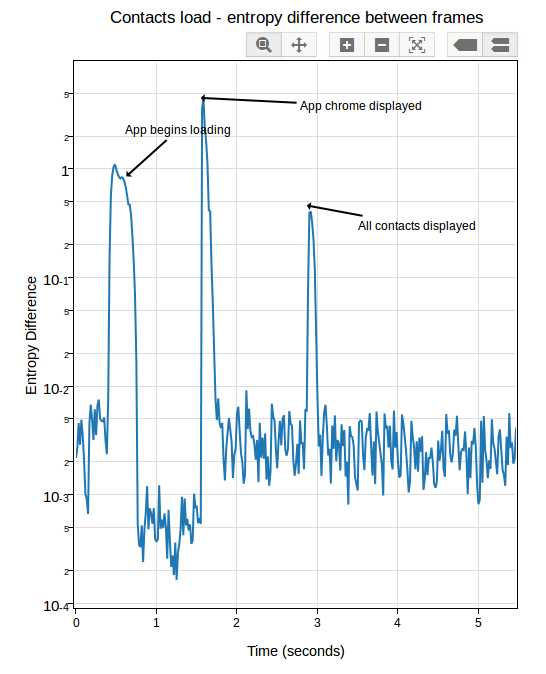
[Link to original]
If you look closely, you can see some minor variance in the entropy differences depending on the state of the screen, but it’s not nearly as pronounced as before. In practice, I’ve been able to get extremely consistent numbers with a reasonable “threshold” of “0.05”.
In Eideticker I’ve tried to steer away from using really complicated math or algorithms to measure things, unless all the alternatives fail. In that sense, I really liked the simplicity of “pixel differences” and am not thrilled about having to resort to this: hopefully the concepts in this case (histograms and entropy) are simple enough that most people will be able to understand my methodology, if they care to. Likely I will need to come up with something else for measuring responsiveness and animation smoothness (frames per second), as likely we can’t count on light composition changing the same way for those cases. My initial thought was to use edge detection (which, while somewhat complex to calculate, is at least easy to understand conceptually) but am open to other ideas.
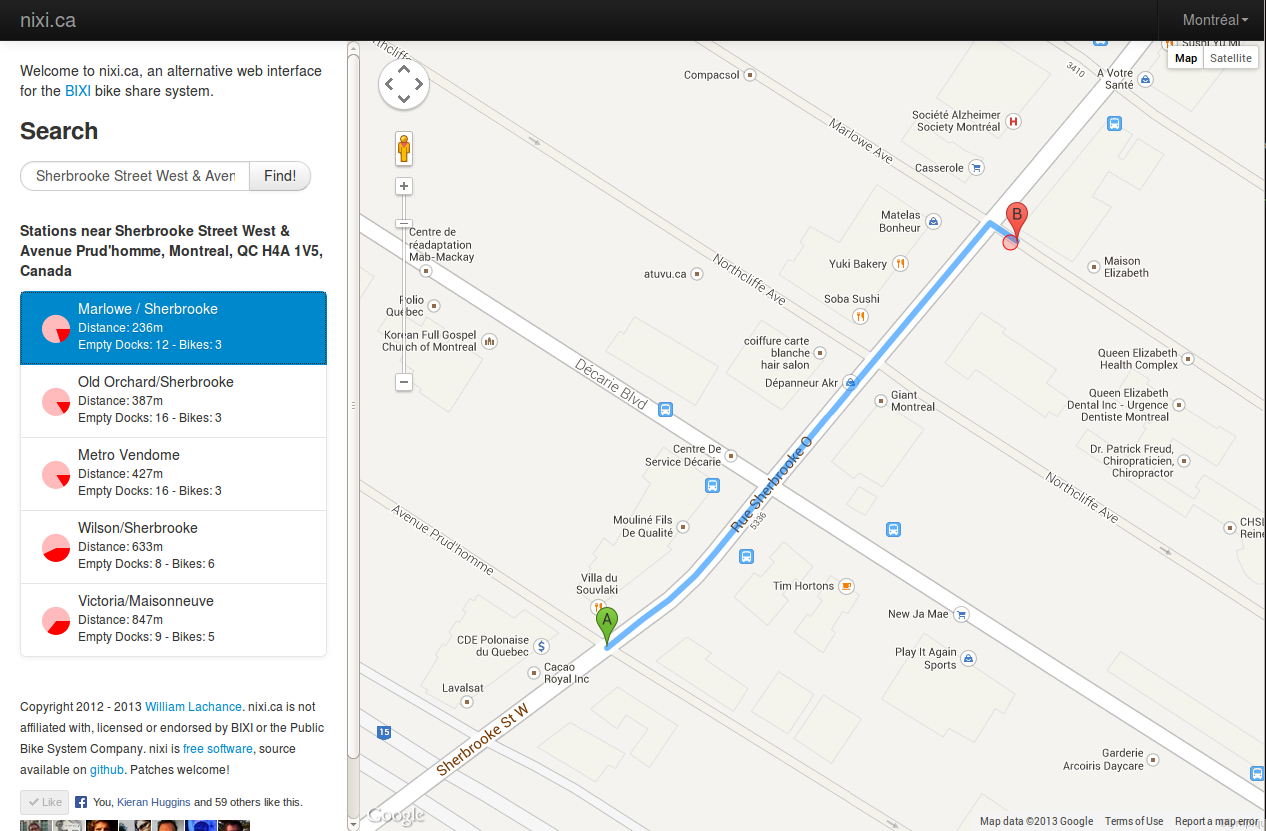
I’ve been working on a new, mobile friendly version of Nixi on-and-off for the past year and a bit. I’m not sure when it’s ever going to be finished, so I thought I might as well post the work-in-progress, which has these noteworthy improvements:
- Even faster than before (using the Bootstrap library behind the scenes, no longer using slow canvas library to update map)
- Sexier graphics (thanks to the aforementioned Bootstrap library)
- Now uses client side URLs to keep track of state as you navigate through the site. This allows you to bookmark a favorite spot (e.g. your home) and then go back to it later. For example, this link will give you a list of BIXI docks near Station C, the coworking space I belong to.
If you use BIXI at all, check it out and let me know what you think!