Showing posts tagged Data Visualization
After my post on measuring checkerboarding in mobile Firefox, Clint Talbert (my fearless manager) suggested I run a before and after test to measure the improvement that just landed as part of bug 709512. After a bit of cleanup, I did so, measuring the delta between my build on December 20th and the latest version of Aurora. The difference is pretty remarkable: at least on the LG G2X that I’ve been using for testing, we’ve gone from checkerboarding between 10–20% of the time and not checkerboarding almost at all (in between two runs of the test with the Aurora build, there is exactly one frame that checkerboards). All credit to Chris Lord for that!
See the video evidence for yourself. Before:
After:
Just before I leave for some Christmas vacation, it’s time for another update on the state of Eideticker. Since I last blogged about the software, I’ve been working on the following three areas:
- Coming up with better algorithm (green screen / red screen) for both determining the area of the capture as well as the start/end of the capture. The harness was already flood filling the area with these colours at the beginning/end of the capture, but now we’re actually using this information. The code’s a little hacky, but it seems to work well enough for the test cases I’ve been using so far.
- As a demonstration, I wrote up a quick test that demonstrates checkerboarding on mobile Fennec, and wrote up a quick bit of analysis code to detect this pattern and give an overall measure of how much this test “checkerboards” (i.e. has regions that are not fully painted when the user scrolls). As I understand this is an area that our mobile team is currently working on this problem quite a bit, it will be interesting to watch the numbers given by this test and see if things improve.
- It’s a minor thing, but you can now view a complete webm movie of the captured movie right from the web interface.
Here’s a quick demonstration video that shows all the above in action. As before, you might want to watch this full screen:
Happy holidays!
Since I last blogged about Eideticker, I’ve made some good progress. Here’s some highlights:
- Eideticker has a new, much simpler harness and tests are much easier to write. Initially, I was using Talos for this task with the idea that it’s better not to have duplicate code where it’s not really required. Seemed like a fine idea in principle, but in practice Talos’s architecture (which is really oriented around running a large sequence of tests and uploading the results to a central server) was difficult to extend to do what we need to do. At heart, eideticker really only needs to do a few things right now (start up Firefox, start videocapture, load a webpage, stop videocapture) so it’s best to keep things simple.
- I’ve reworked the capture analysis API to use numpy behind the scenes. It’s still not quite as fast as I would like (doing a framediff analysis on a 30 second animation still takes a minute or so on my fast machine), but we’re doing an order of magnitude better than before. numpy also seem to have quite the library of routines for doing the types of matrix algebra useful in image analysis, which should be helpful as the project progresses.
- I added the beginnings of a fancy pants web interface for browsing captures and doing visualizations on them! I’m pretty happy with how this is turning out so far, it’s already been an incredibly useful tool for debugging Eideticker’s analysis system and I think it will be equally useful for understanding Firefox’s behaviour in general.
Here’s an example analysis session, where I examine a ~60 second capture of the fishtank demo from Microsoft, borrowed from Mark Cote’s speedtest library. You might want to view this fullscreen:
A few interesting things to note about this capture:
- Our frame comparison algorithm is still comparatively dumb, it just computes the norm of the difference in RGB values between two frames. Since there’s a (very tiny) amount of noise in the capture, we have to use a threshold to determine whether two frames are the same or not. For all that, the FPS estimate it comes with for the fishtank demo seems about right (and unfortunately at 2 fps, it’s not particularly good).
- I added a green screen / red screen at the start / end of every capture to eliminate race conditions with starting the capture, but haven’t yet actually taken those frames out of the analysis.
- If you look carefully at the animation, not all of the fish that should be displaying in the demo are. I think this has to do with the new native version of Fennec that I’m using to test (old versions don’t exhibit this property). I filed a bug for this.
What’s next? Well, as I mentioned last time, the real goal is to create a tool that developers will find useful. To that end, we have plans to set up an Eideticker machine in Mozilla Mountain View office that more people can use (either locally or remotely over the VPN). For this to be workable, I need to figure out how to get the full setup working on “demand”. Most of the setup already allows this, with one big exception: the actual Android device that we want to capture video from. The LG G2X that I’m currently using works fine when I have physical access to it, but as far as I can tell it’s not possible to get it outputting proper video of an application unless it’s in an unlocked state (which it obviously isn’t most of the time).
My current thinking is that a Panda Board running a Vanilla version of Android might be a good candidate for a permanently-connected device. It is capable of HDMI output, doesn’t have unwanted the bells and whistles of a physical phone (e.g. a lock screen), and should be much reliable due to its physical networking. So far I haven’t had much luck getting it the video output working with the Decklink capture card, but I’ve only just started trying. Work will continue.
If I can somehow figure that out, and smooth out some of the rough edges with the web interface and capture API, I think the stage will be set for us all to do some pretty interesting stuff! Looking forward to it.
I’ve been spending the last month or so at Mozilla prototyping a new project called Eideticker which aims to use video capture data and image/frame analysis for performance measurement of Firefox Mobile. It’s still in quite a rough state, but it’s now complete enough that I thought it would be worth spending a bit of time describing both its motivation and how it works.
First, a bit of an introduction. Up to now, our automated performance tools have used entirely synthetic benchmarks (how long til we get the onload event? how many ms since we last hit the main loop?) to gather performance information. As we’ve found out, there’s a lot you can measure with synthetic benchmarks. Tools like Talos have proven themselves by catching performance regressions on a very regular basis.
Still, there’s many things that synthetic benchmarks can’t easily or reliably measure. For example, it’s nice to know that a page has triggered an “onload” event (and the sooner it does that, the better), but what does the browser look like before then? If it’s a complicated or image intensive page, it might take 10 or 15 seconds to load. In this interval, user studies have clearly shown that an application displaying something sooner rather than later is always desirable if it’s not possible to display everything immediately (due to network traffic, CPU constraints, whatever). It’s this area of user-perceived performance that Eideticker aims to help with. Eideticker creates a system to capture live data of what the browser is displaying, then performs image/frame analysis on the result to see how we’re actually doing on these inherently subjective metrics. The above was just one example, others might include:
- Measuring amount of time it takes to actually see the start page from time of launch.
- Measuring amount of time you see the checkboard pattern after panning the browser.
- Measuring the visual artifacts while loading a complicated page (how long does it take to display something? how long until we get something close to the final expected result? how long until we get the actual final result?)
It turns out that it’s possible to put together a system that does this type of analysis using off-the-shelf components. We’re still very much in the early phase, but initial signs are promising. The initial test system has the following pieces:
- A Linux workstation equipped with a Decklink extreme 3D video capture card
- An Android phone with HDMI output (currently using the LG G2X)
- A version of talos modified to video capture the results of a test.
- A bit of python code to actually analyze the video capture data.
So far, I’ve got the system working end-to-end for two simple cases. The first is the “pageload” case. This lets you capture the results of loading any page within a talos pageset. Here’s a quick example of the movie we generate from a tsvg test:
Here’s another example, a color cycle test (actually the first test case I created, as a throwaway):
After the video is captured, the next step is to analyze it! As described above (and in further detail on the Eideticker wiki page), there’s lots of things we could measure but the easiest thing is probably just to count the number of unique frames and derive a frame rate for the capture based on that (the higher the better, obviously). Based on an initial prototype from Chris Jones, I’ve started work on a python library to do exactly this. Assuming you have an eideticker capture handy, you can run a tool called “analyze.py” on the command line, and it’ll give you its best guess of the # of unique frames:
<br /> (eideticker)wlach@eideticker:~/src/eideticker$ bin/analyze.py ./src/talos/talos/captures/capture-2011-11-11T11:23:51.627183.zip<br /> Unique frames: 121/272<br />
(There are currently some rough edges with this: we’re doing frame comparisons based on per-pixel changes, but the video capture data is slightly noisy so sometimes a pixel changes its value even when nothing has actually happened in the browser)
So that’s what I’ve got working so far. What’s next? Short term, we have some specific high-level goals about where we want to be with the system by the end of the quarter. The big unfinished pieces are getting an end-to-end test involving real user interaction (typing into the URL bar, etc.) going and turning this prototype system into something that’s easy for others to duplicate and is robust enough to be easily extended. Hopefully this will come together fairly quickly now that the basics are in place.
The longer term picture really depends on feedback from the community. Unlike many of the projects we work on in automation & tools, Eideticker is not meant to be something that’s run on every checkin. Rather, it’s intended to be a useful tool that can be run on an as needed basis by developers and QA. We obviously have our own ideas on how something like this might be useful (and what a reasonable user interface might be), but I’ve found in cases like this it’s much better to go to the people who will actually be using this thing. So with that in mind, here’s a call for feedback. I have two very specific questions:
- Is there a specific problem you’ve been working on that a framework like this might be helpful for?
- What do you think of the current workflow model described in the README?
My goal is to make something that people will love, so please do let me know what you think. Nothing about this project is cast in stone and the last thing I want is to deliver a product that people don’t actually want to use.
Equally, while Eideticker is being written primarily with the goal of making Mobile Firefox better (and in the slightly-less short term, desktop Firefox and Boot to Gecko), much of it is broadly applicable to any user-facing mobile or desktop application. If you think some component of Eideticker might be interesting to your project and want to collaborate, feel free to get in touch.
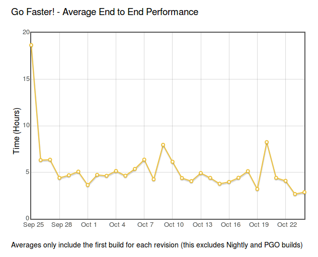
So as others have been posting about, we’ve been making some headway on our progress on the GoFaster project. Unfortunately it seems like we’re still some distance away from reaching our magic number of a 2 hour turnaround for each revision pushed.

It’s a bit hard to see the exact number on the graph (someone should fix that), but we seem to teetering around an average of 3 hours at this point. Looking at our build charts, it seems like the critical path has shifted in many cases from Windows to MacOS X. Is there something we can do to close the gap there? Or is there a more general fix which would lead to substantial savings? If you have any thoughts, or would like to help out, we’re scheduled to have a short meeting tomorrow.
Anyone is welcome to join, but note that we’re practical, results-oriented people. Crazy ideas are fun, but we’re most interested in proposals that have measurable data behind them and can be implemented in reasonable amounts of time.
There’s much to like about the BIXI bike-sharing system in Montréal: it’s affordable ($78 for a year of biking), accessible and fun to use. There’s absolutely no doubt in my mind that it’s made cycling more of a main stream activity here in Montreal, which benefits everyone (even drivers indirectly gain from less congested streets).
With the arrival of the first BIXI stations in NDG, I decided to subscribe to it this year even though I have a bike of my own. So far, it looks like I’m going to easily use it enough to justify the cost. I still use my regular bike for my commute from NDG to the Plateau, but on the edges there’s a ton of cases where it just makes sense to use something that I don’t have to worry about locking up and returning home. Sometimes I only want to go one way (for weather or whatever other reason). Other times I want to take public transit for one leg of my trip (or day), but need/want to take a quick jaunt elsewhere once I’m downtown.
I do have to say though, their new web site drives me crazy. I’ve thought prety deeply about the domain of creating user-friendly transit-focused web sites, so I think I can speak with some authority here.

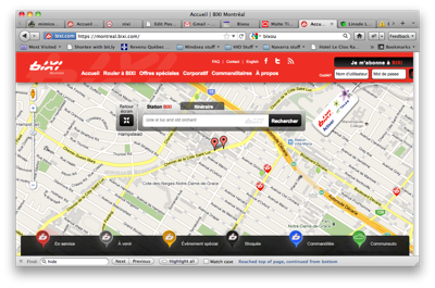
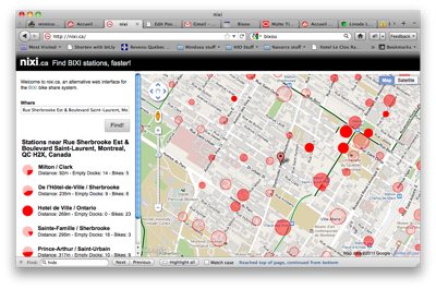
Leaving aside it’s value as a promotional tool for the service itself (not my area of expertise), the experience of trying to find a nearby station is complicated by a slow, multi-layered UI that requires repeated clicking and searching to find the nearest station that has bikes available. Why bother with this step when we can just display this information outright on the map? iPhone applications like Bixou have been doing this for years. It’s time we brought the same experience to the desktop.
Thus, I present nixi.ca: a clean, useable interface to BIXI’s bike share system that presents the information you care about as effectively as possible, without all the clutter. I’ve already found it useful, and I hope you do too. Think you can do better? Fork the source on github and submit your changes back to me! Minus some glue code to fetch station info server side, it’s entirely a client-side application written in HTML/JavaScript.

Note that the site uses a bunch of modern HTML5 features, so currently requires a modern browser like Firefox, Chrome, or Safari to display properly. I may or may not fix this. Other notable omissions include support for other cities with the BIXI system (Toronto, Ottawa, …) and French localization. Patches welcome!
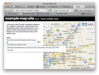
Finally got around doing something I’d meaning to for a while, which is create a simple template for a web-based mapping application based on jQuery and some of my earlier work on routez. I’m hoping this might be useful as a starter for a few open data applications!

Preview Source
First, I’m overdue in announcing Transit to Go a.k.a. “the iPhone transit map that’s demonstrably more useful than a paper schedule” a.k.a. “your bus departure in 15 seconds or less, no matter where you are”. I wrote up a blog post about it for Mindsea‘s site, if you’re interested in finding out more.
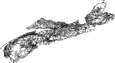
Second, all this transit excitement has made me start thinking about better routing and geometry algorithms again. I’ve been experimenting a bit with Brandon Martin Anderson’s prender framework, used by the infamous Graphserver, and have been pretty happy with the results. It basically lets you do processing visualizations in python (i.e. no Java coding required). Here’s a quick picture of it in action, rendering the Nova Scotian road network, as distributed by geobase.

The neat thing about this framework is that you can render quickly to an arbitrary level of detail, which should prove very useful when troubleshooting the behavior of some of the code I’m working on. If anyone is interested in running the framework on MacOS X (like I was), my fork of the project has the appropriate patches.
